Here is my final Digipak:

Here is my final Poster:


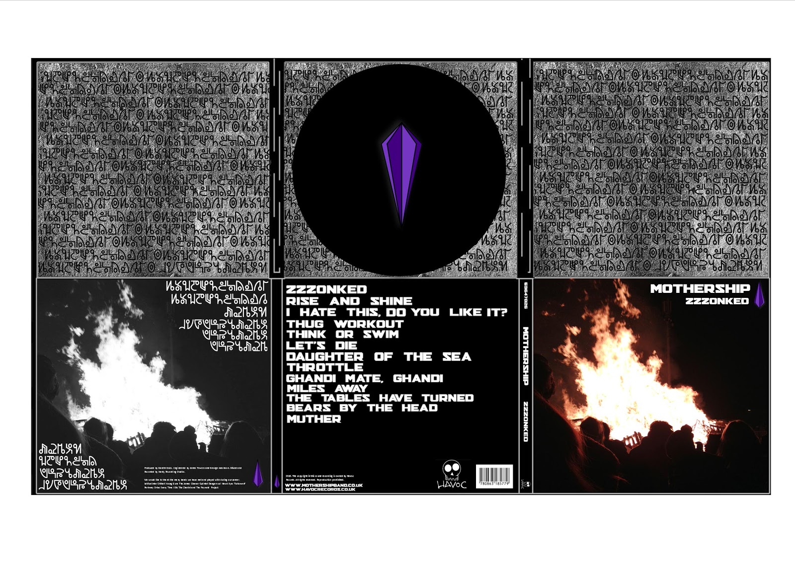
I am very pleased with the outcome of my digipak, as you can see it has improved vastly from my draft and throughout the development. I used the alien writing to fit in with the band name 'mothership' and fit in with the connotations or the name and the genre. I used Photoshop to invert the 'alien writing' into the circle in the top panel, i believe this is very effective and adds a good twist to the product. I also adjusted the brightness and contrast slightly on the background image, this was too make the cover stand out a bit more and look more proffessional. I also re-arranged the album title and band name, after my development i believe i chose the right position for this as it looks the most effective and professional. You can also see the inclusion of the 'thankyou's' on the right panel, this was to create a sense of realism, as this is the bands first album it is common to give out thankyou's to other bands and the people who helped them create the album. I also added the record label i made 'Havoc Records', this creates a sense of realism and fits in with the bands genre and style.
Here is my final Poster:

I havent altered the poster as much as I have the Digipak, the only changes from the draft were the inclusion of the image for the background, which i felt worked very well and brings the rest of the poster forwards making it stand out to the reader. Also, I got rid of the green 'lazer' lines, which I wasnt too keen on doing as i thought they were very effective, but with the background they didnt suit it and looked out of place and wrong. Plus I shrunk the size of the websites at the bottom as they were too big and I wanted to make it more realistic. Since the development, I also adjusted the brightness and contrast of the background image to match that of the album cover.
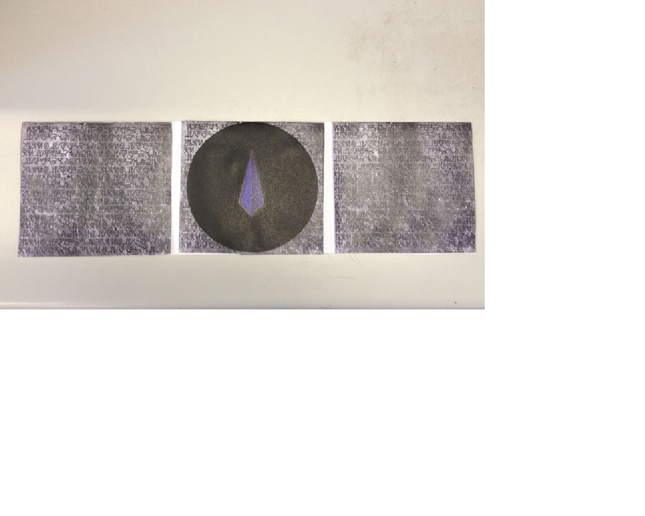
Here are actual photos of my printed out digipak. I am very happy with the way they turned out.


No comments:
Post a Comment