Thursday 20 December 2012

Today

We are working on our evaluation questions, trying to think of interesting ways we can present them.

Ideas so far:

Magazine Article
Letter
Commentary of Video
Band Interview

Friday 14 December 2012

Todd W: Evaluation Question 1 Draft

1.       In what ways does your media product use, develop or challenge forms and conventions of real media products?
Our music video uses and develops many types of conventions that are used in real media products of the same genre. To find out what types of conventions are used in the genre we first did lots of research. This included looking at music videos from the same genre, album artworks, digipaks and live performances. All of what we looked at had an influence on our video in some way.
To begin with we noticed that almost all of the music videos in our chosen genre were performance based. After seeing this we decided that our video would be performance based as well to fit in with this theme. We also decided this was the best thing to do as we had experience in playing instruments and performance.
We noticed that many real music videos of the genre used black and white effects on their videos this made the video look dark and gritty which conveys the genre well. As a result of this we decided to use black and white effects in our own video and we felt that it made it look a lot more professional than when the video had colour. It also conveyed our genre a lot better than before giving it a real gritty feel which is what we were aiming for.
A lot of music videos that we looked at used very fast paced editing and camera shots. We tried to replicate this by using hand held shots throughout the video, I also continuously shook the camera slightly to make the video even more fast paced and energetic. We felt this portrayed our genre perfectly as the song we used is very fast paced and energetic.
As our chosen song was by ‘Enter Shikari’ we were heavily influenced by their style and music videos, we wore very similar clothing to what they wear in their videos and live performances and tried to perform in a similar way to how they perform in their videos.
For my Digipak and poster I looked at many examples from our chosen genre and noticed that to my surprise that a lot of the covers were very minimalistic which is almost the exact opposite from what you would expect from this type of music. I then noticed that triangles were a very prominent shape in the genre and were being used on a lot of album covers so I decided I would implement this on my own digipak and poster. My digipak is also heavily influenced by ‘Enter Shikari’s’ album artwork on their album ‘A Flash Flood of Colour’ which used a very prominent triangle in the centre of the cover. So I implemented this onto my own cover and poster.

Thursday 13 December 2012

Tuesday 11 December 2012

Evaluation Question 1 DRAFT - Brad

1. In What ways does your media product use, develop or challenge forms and conventions of real media products?

Our media product uses, develops or challenges forms and conventions of real media products as we have looked at many other existing videos that are out there and took bits as inspiration to continue filming and editing our own to make it look the part and fit into place with our chosen genre. One way would be that we took out all our hand held shots within our draft; this adds a lot more energy to the entire video throughout. This challenges forms of existing videos as they too have included this simple but effective method of filming. We found that it was a lot easier and effortless to film as you could just do one continuous shot whilst filming for the whole song.

Another way would be the way that parts are edited, we saw that on some existing conventions of music videos that the editing was extremely fast paced, this is also to convey more energy to an audience when they are watching the video. Furthermore, in parts we made the editing glitch in a way so that it fits in with part of the song and again ties in with our chosen genre. From the research and planning that we completed it was clear that not every video was the same, we found that some conventions of real media products use black and white throughout the entire video. Not only does this look good depending on the location but it also adds more of a “gritty” feel and therefore this effect correlates to the genre.

Our video developed from the draft massively as the editing looked a lot more professional, not only this but it challenges other forms of real media products by including a lot of slow motion shots during parts of the song where it is needed and is suitable. We found that in the research and planning process that other conventions of media products use this to get the right message for the song across not only that but to display the action in another type of way. By seeing slow motion used within a song from our genre is good as you can see that the editing does not always have to be continuous quick cuts and fast editing, from our music video you can evidently see that we have included both fast paced and slow motion editing, we found out during the editing process that these both complement each other if they are used in the right context.

The research and planning process showed us that some real forms of media products have a large location and a crowd interaction so that more energy is portrayed, we had to substitute for the crowd but in place we chose a smaller location so that it did not look too empty and bare. If we chose a large location and did not have a crowd then it would have looked quite odd due to the lack of energy that would have been shown within the video. But in the end having a smaller room and location meant that we could show as much energy as some of the music videos within our genre that contain a crowd.

During making the Digipak I knew that something fairly generic was needed so that I can portray the genre that we chose easier, with this in mind it was clear from the start that it would be best to make a development of existing Digipaks/Album covers. I took influences from many bands one being ‘While She Sleeps’ and their album ‘The North Stands For Nothing’, I saw that they used purely black and white on their album cover and therefore I used this. In development of this I used a picture of a crowd that I took during playing a gig and changed it into a black and white image. In the process of making the back of the Digipak I took inspiration from an ‘Asking Alexandria’ called ‘To The Stage’, the writing in this video is outlined with a white box, I thought this looked quite different and therefore used and developed it to make my final writing on parts of my Digipak stand out.

Evaluation Question 4 DRAFT Jack M

Question 4. How did you use media technologies in the construction and research, planning and evaluation stages?

Technology I used in the production of the final pieces and the research, planning and evaluation pages:

4 Main Groups-


Edit and Create

Digital Camera - to film the video, this was a small camera so worked well when creating hand-held shots. It was also a high quality camera so we were able to film our video knowing that the footage will be good quality.

iPhone - For many things - Blogger App. - Allowed me to access the blog via my mobile phone which allowed me the make posts whilst away from a computer. It also allowed me to take photographs throughout this coursework task, most notably the photo of the fire used for my poster and digipak.

Photoshop CS6 - This software allowed me to create my digipak and poster. I found it relatively easy to use and enjoyed developing my skills in the program.


iMovie - This was used throughout the editing stage of the video, since doing the prelim task at the start of the year i have found this program pretty simple to use and enjoyed editing the footage.


Feedback

Twitter - The bands twitter account was used to speak out to the fan base and get feedback for our video. Twitter is one of the most vital technologies bands use today to reach out to the public and advertise their products.

Facebook - This allowed us to use our personal Facebook accounts to distribute our video to our friends on the social networking sites, this led us to gain some comments regarding our video and a numerous amount of 'likes' for our video.

Presentation

Slideshare - This program allows you to upload slideshow and publisher documents to the blog, this came in handy during the research planning and evaluation stages of the project.

Scridb - This program allows you to upload word documents to the blog, this came in handy during the research planning and evaluation stages of the project.

Blogger - Perhaps the most vital technology we used was Blogger. this internet broadcasting site has allowed us to store our pieces of work and show the examiner exactly how we got to our final product. Blogger has been very useful as it can support any file or request we wanted and allowed us to all store our work together as a group.

Animoto - Animoto came in handy during our pitch and my evaluation questions. We used it to create videos containing text, images and our choice of song.

Generally Useful

iPod - The iPod was useful in two ways, firstly when deciding on the song we wanted to choose for our video, and secondly when playing our song through the PA at the rehearsal room where we filmed our video.

eMail - eMail was useful when sharing ideas with the rest of my group, and when receiving feedback from my teachers, as it is a quick and easy method of communication i was able to talk to my teachers about my work easily and effectively.

Safari (blogger) - Access to the internet was vital. Safari allowed me to use search engines for my research and also gave me access to blogger.

Youtube - This was important especially throughout my research and planning, as i was able to use it to search for similar videos which gave me ideas. Another way it came in handy was finding turorials for iMovie for when the video was being edited, and for Photoshop CS6 when i was designing my poster and digipak.

Evaluation Question 3 DRAFT - Jack M

Question 3 What have you learned from your audience feedback?

I have recieved a lot of feedback from my audience, both from my selected target audience and from people outside my target audience. I got comments on the youtube upload of my video, written down feedback from my classmates and then word document assessments from my peers for my ancillary tasks.

Monday 10 December 2012

Evaluation Question 2 DRAFT - Jack M

EVALUATION 2. How Effective is the Combination of Your Main Product and Ancillary Texts?

I think that the combination of my products are very effective throughout all three texts, as i think i have created a brand image for my created band that fits in with similar real life artists today. Using the same font (hunter squared, from dafont.com) throughout my Digipak and Poster has allowed me to create an effective image for the band, this is also backed up by the use of the same background image within both of my ancillary tasks. Also using the crystal logo has allowed me to create a noticable image that will be recognisable for a band with a large fanbase, this is a common technique that is seen in large rock bands today, for example Enter Shikari use an upside down triangle as their band logo. This sense of branding is used to represent the band and for the fan base of the band to recognise the certain images and logos used. For example the fans of a certain band will feel good wearing clothing with certain logo's on as it would allow them to feel part of the bands fan base which, especially young people, take a lot of pride in. I used the fire in the background of my poster and Digipak to convey a sense of outrage and anarchy, this fits in with he genre of music in the video. I chose to do this so I could combine the fire image and the way the band act in the music video, as they are jumping around and hitting the floor etc. so it fits in with this sense of destruction and anger, so i wanted this message to be conveyed throughout my 3 products. A good way in which i have combined my main product and ancillary texts is by using a 'space' related theme, as i use what look like alien text on my Digipak, this also relates to the band name 'Mothership', which then relates to the style of song we chose, as it has electronic influence and uses synthesisers to create a space-type feel. These all combine to create a good image of the bands style of music, as the audience will generate an alien and space idea of the band.  I chose not to include any shots of space or any spaceships (mothership) in my product as i thought this would be too cliche and I wanted to be more subtle with this style and image i was try to convey. I also thought this would make the band look quite childish and amateur as it is common for bands within the same genre to have a totally unrelated name to their style of music or their image they give off.
Using 'Havoc Records' as the record label for Mothership has given the band a sense of realism and professionalism. Taking influence from the current label 'Hassle Records' I created this label to give the band another aspect of branding, as the logo i created is featured on both the poster and digipak, i think this has worked well and helps my products to fit in with products that are already on the market. However, if i were to add anything to my final product i think that adding the Havoc Records logo at the end of the video would complete this sense of branding. Many bands do this, however it seems to be only the smaller bands that have their record label at the end of their videos as maybe they need more recognition and want to be advertised to the public more. As you can see there is a correlation between the black and white of the music video and of the panel in the Digipak, this also shows the way in which i have used a combination of syles in each of my products to create a sense of branding.

Evaluation Question 1 DRAFT - Jack M

EVALUATION 1. In what ways does your media product use, develop or challenge forms and conventions of real media products?

My media product challenges and uses forms and conventions of real media products, especially within the final music video. As bands of a similar genre typically stick to a performance video, we chose to do the same, this is because it is an effective way of conveying energy and outrageous behaviour, which is something the rock genre is noted for. The way in which we used conventions of videos are most notably with the fast cuts and moving shots I used, I included zoom shots, track shots and pan shots within the video to create the energetic feel that my music video needed. Examples of this are found in the video for the song we chose 'Zzzonked' by Enter Shikari, as the video for that is solely performance and includes very fast cuts. Another way we used a real product to influence ours is through the use of the black and white colours, as again the video for Zzzonked is in black and white, however i have found that this is quite rare for a rock performance video as they are usually in colour, such as the video for 'Song 2' by Blur. The decision to make our video in black and white was to stop our video looking budget as I found it hard to create an effectiver frame using our clothes and the minimal lighting we had available. Another way my music video uses convenions of real music products is the mise en scene of the room we filmed in, as its size is very small it makes the video claustrophobic, also the walls are very plain. Examples of a small simple room are in the video for Paramore's 'Ignorance' and for Hawk Eyes 'Kiss This' video. These are both similar styled videos with similar genres. I think that the decision to film in this room was very good as it made our video look more realistic and impressive, especially as it significantly keeps in with the genre of our music. The inclusion of slight humour within the video actually challenges the conventions of real media products, as in nearly all rock performance videos the band looks quite serious and maybe try to convey a sense of anger within their music, especially within the heavier forms of rock. However we wanted to challenge this as we belive music isnt meant to be that serious and we thought it would be a good idea to speak out to our target audience using humour, this is why shots with funny faces are included. My Digipak and poster also fit in with the conventions of real media products, I took a real inspiration from the Album cover i analysed in my research and planning (Every Time I Die - Ex Lives). As this uses a bright pink 'I' that stands out from the hectic background, i really like this use of a logo as it represents the band effectively in a simple way. This is why I used the crystal idea, as i wanted to create a little logo or image that can represent the band, I used this in the centre of my poster and in the corner of my digipak. I think this worked well and am happy with the outcome. I also this crystal across the digipak and poster to really press this logo upon my target audience, as once a band uses a log it often sticks with them throughout their career, it also allows fans to represent their band i.e. through merchandise (t-shirts etc.)

Sunday 9 December 2012

Feedback from Peers

Here is a peer viewing our video, we are very happy with the response we got from our classmates. After viewing our video this peer Stephen said to me that he 'enjoyed the video and liked how fast it was', he also commented on our playing of the instruments and the committment to the song we had. He also very strongly praised the editing as the 'parts where it flickers look really good'. This response was good for us as he is within our target market group as he is 17 years old and likes the music that we based our video on.

Saturday 8 December 2012

Presenting to the Class

After finishing the video we presented our final piece to the class. We got lots of feedback from our peers and we will collect and evaulate this and then upload it to the blog.

Friday 7 December 2012

Evaluation UNFINISHED

1. In what ways does your media product use, develop or challenge forms and conventions of real media products. Our music video does not particularly challenge or develop forms and conventions of the typical music videos of our genre. The original video for ‘Zzzonked’ by Enter Shikari is a pure performance video, which is in black and white, which shows that the way we have made our own video is not a completely original idea. We thought that making a video in this way would be the best way to connect to our intended target audience. As in rock music, live music is seen as just as big a part of a band as an album is, it is a good way to bring this live music into a music video. It also makes a statement about the style and energy of the band, and in our video we wanted to create a lot of energy through the movement of the camera, which is used in the video for ‘Skyspinners’ by Hawk Eyes which is another similar to our target audience. As the target audience is mainly male ages 16-24 gig goers, our music video works, because it appeals to these people through the energy projected and the feel of a live gig, much like the way Enter Shikari music video appeals to people of a similar target audience. My digipak is similar to many albums from bands, especially that of debut albums. As seen in my planning and research, debut albums from Slipknot and Don Broco use very simplistic album covers, with no real album artwork, with Slipknot it is a photo of the band with the band name, and with Don Broco, it is just the band name alongside the tracklisting that is notable. My magazine advertisement uses typical conventions of current media products. It is a simplistic idea that simply expresses the album cover, the band name, and reviews from mainstream rock magazine’s. The mention of these magazine’s, and the fact that they have approved of the magazine…..

Friday 30 November 2012

Music Video Pre-Lip Sync Improvements

Effectiveness of Black & White

Due to our first draft video being in colour we found that it didn't quite look right and also it was harder to convey the genre. Because the genre is usually conveyed as quite dark and 'gritty' we needed to change the colouring of the entire video when editing it for our final version.

Looking back and comparing both the draft and our final versions of the music video, it is clear that the back and white look seemed to be more effective and really compelled the way out editing was put together.

Moving on, we also looked at many videos and examples of existing conventions and took ideas from each one then combined them all. We did this not only in the way that we edited the video but in the way that we filmed the video.


Editing

We began editing our video this morning, we are very happy with the progress it has made from our draft as all the shots are much better and make the video more professional. We just need to continue this good quality and complete the video to the best of our ability

Editing Progress

We are currently in the process of editing our final music video, during editing we are discussing what shots should go next to make the best video out of our footage.

The filming process took a good hour and a half and within that we got approximately 29 minutes of footage, this should be enough to create a high standard video and therefore gives us choice of many different shots that we included during filming.

We mainly used hand held shots to create much more of a hectic atmosphere and with quick paced editing it will create the energy needed for the genre of our music video.

Filming Complete

We filmed our video yesterday and this time it went very well, the filming process was smooth and no problems were encountered along the way. We got many shots that werent static to create the energetic feel our video needed and our draft lacked. The room was also very small so the shots are tight and claustrophobic, another aspect that we think we go in our favour. We are very pleased with how filming went and we looked at some of the footage striaght after our session and we were impressed and pleased with what we had captured. We will start editing the footage today.

Thursday 29 November 2012

Filming Our Final Video

Tonight we are filming our final video again at stayfree studios but after feedback given from teachers and fellow pupils after filming we decided to film in a room that wasn't as white before, because the lighting didn't fit the style of the video well, so we decided to film in the red room, which is much smaller and darker, and therefore we hope it gives a darker better more rocky feel to the whole video. As well as this we are going to get much more handheld shots than last time, to add energy to the video as the whole of the draft video was static, and therefore the energy was scarce. As well as this we are going to record more footage hopefully, as we ended up repeating shots over and over in the draft video.

Black and White

We have decided that we can make our music video much miore proffessional by applying a black and white filter to it. We belive that this makes it look less amatuer and will make our video more appealing. However, we have not yet decided if we are going to keep the entire video in black and white. We may, when it comes to editing, decide to add splashes of colour, this would make it more entertaining and will make the video visually interesting.

Filming Delays and Re-Organisation

After some serious delays we couldnt film our video on the arranged days, so we have finally came together and arranged to film our video tonight, and then upload and edit the footage tonight and over the next few days. This has been a problem as we could have spent the time editing but due to unfortunate circumstances we could not fiom, so we are going to have to work around this problem and complete the task with the best of our ability.  

Wednesday 21 November 2012

Today.

Today was spent evaluating our peers' draft digipak and poster. This task has allowed me to both understand the mark scheme and learn how my own coursework will be assessed. But also it has allowed me to view other people's work, allowing me to learn ideas and methods from them.

Tuesday 20 November 2012

More changes...

We have tried to book the room for tonight but the room we want is full, we could have chosen a different room and done the filming tonight but we decided as a group to leave it and stick with the Black room but film on a different day. We are now looking at the weekend, perhaps Saturday evening for filming time. This however will only give us a week to edit as the deadline for our video is the 30th of November.

Monday 19 November 2012

Location Changes

After the feedback we recieved from our teachers for the Draft music video, we decided to relocate our music video to a darker room, we have decided to stick with the same business, Stayfree Rehearsal Rooms, but have chosen to film in the 'black room' this time. As oppose to our draft which we filmed in the 'white room', we hope this will make our video look more real and represent our genre and style more. We may also need to consider props in our video, maybe a flag or poster of some sort in the backdrop, plus we are going to use some tape to create a giant 'M' on the bass drum, representing our band name Mothership. We feel that this is a common aspect to rock bands as they regularly have their band name displayed on the drum kit, or even a message of some sort, mostly using tape, but the more established bands often have their own custom graphics on their drum kit. Here are some examples of these bands:


Here is a photo of the room we will be using when we re-film our our final music video:


As you can see the rooms are a lot darker and will hopefully help us get a better overall look from our music video, as we want it too seem more raw, and not like we are just in a rehearsal room. The stayfree logo at the back will be removed when we film.

Sunday 18 November 2012

Changes to Filming

We struggled to get the group together on Saturday so we are trying to re-organise it for a day early next week, most likely on Tuesday.

Thursday 8 November 2012

Digipak & Poster Graphic clarification

Now I am making the final versions of my Digipak & Poster it is clear that I need to include something to some of the panels as they seem to look fairly boring and simple. As you can see from the two photos shown I have designed some extra graphic to fill in the spaces. Once I have polished these up and put them onto photoshop they will then be ready to go onto my final versions of my Digipak & Poster. With this in mind I think they will make a good addition to both my Digipak and Poster as they will be able to convey our chosen genre.


Development of my final Digipak and Poster

This is a photo I took while at a bonfire evening, I chose to do this as i wanted to make the front cover more visually interesting and compelling, so I thought a good way to do this and to stick with the connotations and style of my genre would be to use fire.

I then tried to incorporate the image into the background of my front cover. I believe this instantly makes it more interesting and bold. I am happy with this turn out but I now want to develop the wording and font size of the cover, maybe shrinking the titles down will make the cover better,


First i tested the image as the background of the front cover. I think this looks very effective as it contrasts very well against the purple crystal, this was something i wanted to improve on as it was picked up frequently in the feedback from my classmates and teachers that the front cover was too bland and didn't stand out from the page. This, I believe, is a strong improvement already. 

I then experimented with the font size and positioning, this is because i thought I could further develop my front cover and make it look more professional, as at its current state i believe it still looks as if it is amateur. I came up with this design, it has shrunk down the font and the crystal itself and positioned them in a way that is familiar with many other existing products. I really like this album cover and think it is again a further improvement on the previous design. I still think that it could be slightly improved, i have also noticed that within the photo there is a mobile phone screen (bright blue), i will use Photoshop to correct this image and remove the phone screen, this will make the photo more professional. I may also experiment with the brightness and contrast of the image to see if I can make it stand out more and look more aesthetically pleasing.


I then began to develop my album poster. I think that the only improvements i can make on this (as it currently got 9/10), was to insert the image into the background. Again I am very pleased with the outcome as I believe it makes it look a lot more professional and it makes the writing and the crystal stand out from the background. I used this picture in the poster as well as the album digipak to create a sense of continuity throughout my work, this makes for a more convincing final product. 

Wednesday 7 November 2012

Improving our Music Video

After we handed in our draft music video, we got feedback from our teachers, we got a low level 3 for the video. We were relatively happy with this mark as it is in the higher half on the levels just for our draft, but we know we can definitely improve it and push it up to a level 4. Here is the feedback we got back from our teachers:


We have learnt from this feedback that we need to speed up the shot timings, this will make it slightly more energetic. Plus we need to be a bit more convincing with our instruments  as this will create a sense of realism and be more appealing to the eye of the viewer. One of the main points we have agreed upon is creating more interesting shot types, instead of the static shots we commonly used in our draft, we would like to create a lot more moving shots, these can include hand-held shots, pan shots, zoom, tilt etc. We believe that this would make our video a lot more effective. We need to also contemplate the mise en scene within our video, as our teachers think we should make the background (the room) more interesting. We aren't yet sure how to do this, when we re-film our video we may choose to film in a different room, potentially one with darker walls, as this will go with the connotations of our genre and give it a more realistic feel. 

Tuesday 6 November 2012

First Draft Digipak & Poster Teacher Feedback

Level 3 – 8/10
WWW
Like the black and white and casual feel of band on cover. Panels look ok.
Has the feel of small independent band, image conveys some sense of attitude etc
EBI
Consider same font for mothership on back and spine as front cover, otherwise too many fonts, likewise the M must be the same as the LARGE iconic M on back panel is different.
You’ve missed out the name of the record label in your legal spiel.

Poster Level 2 6/10

WWW
Overall, good feel to this in black and white and good continuity across the products.
Range of conventions followed with release, review etc

EBI

Too busy; shrink down size of review to bottom third of page. Lose the heading at the top in the arrow style symbol. Keep picture of cd and other bits.
Layout of bottom third is wrong, try and lay these out in a more symmetrical fashion.
Likewise reduce size of font for websites, they are currently too large (and too different)
Could a think white line go above the album sleeve image?

Looking at my feedback given a fair amount of corrections need to be made during the process of making my final Digipak & Poster, it is important that I carry out this feedback to get the best possible marks that are available.

Monday 5 November 2012

Feedback from Teachers - Digipak & Poster

My teachers assessed my fraft digipak and poster after I had printed them out and handed them in on time. These were the comments and grades i was given.
WWW = What went well
EBI = Even Better If

'Digipak  level 3   7 / 10
WWW
Nice overall feel and colour scheme. Fits idea of the band and their genre.
The runes/language used on other panels works well
EBI
The digi pac feels a little flat, it doesn’t pop off the page like your group mates
Why does poster have a green element to it and not the digipak? It looks nice, so could be on both to show continuity between products.
Legal jargon needed on back panel, little c not enough
Track 3 font is not aligned properly
Not convinced by the wood effect background


Poster level 4  9/10
WWW
Much better, this pops off the page thanks to the contrast between, black green and purple.
We’ll check with other teachers but we’re happy with this poster.
'
I am pleased with the results i got back from my teachers, especially for the poster,as I scored 9 out of a possible 10. I feel that my actual digipak needs improving a lot as I know I can get better than 7 marks, i would like to push it up to 9 or even 10 marks. I am also definately going to try and improve my marks for the poster as I think I can push that up to full marks aswell.

Saturday 3 November 2012

The following weeks work.

During the next week, we will all begin developing our digipaks and posters. We will take the feedback we got from our teachers and use this to improve our work to try and get a higher mark and therefore a better grade. This, at the end of the week will  mean we will upload our final digipaks and posters. 

Friday 2 November 2012

Our Draft Video

Shots Included In Our Video

During the filming of our Draft music video we included a varied amount of different camera angles and shots. We had to make the video fast paced so it could match the energy that the song conveyed, by doing this we used some medium shots in which some were sped up so that it zoomed into our singers face and gave the video seem like it had more of an energetic feel. Because our music video was purely a performance based video we had to included many close up shots of the instruments which we were playing. We also included a high angle shot to capture our singer singing, I think we might include more of these during the filming of our final video because they fit in with our song. Long shots were used so that the audience could see the whole band performing. Looking back on our video I think we need to include more hand held camera shots so we have a bit more energy within our shots. We could also make the editing slighty quicker so that it shows how much energy is in our video as well as the song.

Thursday 1 November 2012

Editing.

Today we have started to edit our draft music video, we are using iMovie, on my own personal mac, allowing us to do work at home. To get the footage from the camera onto my mac, we used an SD card, which was simple, and then imported all the footage onto imovie, giving us a selection of footage to chop and choose from to go into our music video. To add the song into imovie, we simply had to drag it in to the programme from itunes. The video is starting to look good for a draft, however, the brightness made the video look relatively amateur, and therefore we did some editing of exposure, brightness, saturation and contrast, the settings we chose can be seen below. This makes the video look better, and perhaps like it has been filmed on a higher quality camera, or with different lighting around the room, as we had little to help out our lighting, and had to put up with the lighting we were provided with in the room. One thing I have learnt from making this draft is that you definitely need to film as much footage as possible, and don't be shy to film for longer than you may think is needed, and more shots than you had planned, as we, for the draft, have only 9 minutes of footage, and therefore there will be some recycled shots, so for the final video, we will make sure too film much more footage than we did for this draft.   


Wednesday 31 October 2012

How did the filming of the draft go?

The filming of our draft video went ok. Although I have learnt that when we re-film, which we will need to, for our final video, we will have to plan out much better. For example, we wasted 45 minutes looking for an adapter which would plug into the PA, as the cable I had was shoddy and was not projecting the music loudly enough for us. My friend has one of these adapters, and therefore next time I will make sure I can borrow it before filming, or if I can't, I will buy one, and then we won't have this problem again. After this problem was resolved, we discovered the camera was half full on memory, and therefore we had limiting filming space. Therefore we have ended up with limited shots and will have to recycle shots in our draft. Again this has taught us a lesson, and we will make sure to hire a camera out from school, or use our own personal camera, but make sure they have a good amount of filming time left, before we commit ourselves to filming.

Record Label

After doing our digipaks we realised that we all chose different record labels, these labels were all real aswell so cant be used in our final digipak. So I decided to create this record label logo so our group can collectively use it. I took inspiration from 'Hassle Records' as they sign similar bands to ours and we all listen to a lot of the music they distribute.
Here is our record label 'Havoc Records'.

Tuesday 30 October 2012

Filming.

Today we are filming our music video. We are going to stayfree studios to do this, where we have booked a 2 hour stay in the 'white room.' This room is complete with mixers, amplifiers and speakers, to give the video a realistic performance feel. We will be taking drum cymbals, Electric Guitars and an electric bass. Microphones are provided, and the mixers provided can be used too show the synthesizers from the song. These props will make the song a performance video, as they are the relevant instruments to the song. Clothes being worn include shirts from STEP UP CLOTHING, the clothing line of Enter Shikari singer Rou Reynolds, the band who's song we are using. As well as this, band shirts will be worn, such as Skrillex. It is popular within the rock/electronic and hardcore scenes to 'rep' other bands, to show support to the scene around you. We will also be taking a video camera and a tripod to hold it in place for some shots, but we also hope to take some handheld shots. We will be taking a macbook with the song 'Zzzonked' on it, with a cable which can plug into the P.A, playing the song extremely loudly, so that we can perform over the top of it, helping us to get into the song, as well as play our instruments and sing in time.

Brad E: Album Cover & Poster Draft


Todd W: Poster & Cover Draft

Jack Mugglestone - Digipak


Examples of past editing and filming skills

For our music video my role is to film and help edit the video. I was well suited for this role as i have experience in doing both of this skills before. As a hobby I film and edit skateboard videos so this has given me some good experience in how to film properly and it has given me experience in fast paced editing and filming which will come in very handy when filming our music video as it will fit with the fast paced genre.

here are some examples:

http://www.youtube.com/watch?v=dTCuRSKNYXU

http://www.youtube.com/watch?v=7rAcwC9VwEE

Thursday 11 October 2012

Examples of Performance

These are the kind of energetic shots that we want in our music video that display performance. Although we will probably be going without any sort of crowd and focus primarily on the band playing their instruments etc.


As you can see the misc en scene within the room in which we played was quite dark with very little lighting, although this lightning was focused only on the band members. If we want to create a similar scene we will basically need to use these techniques. You can also see that the room was quite clostrophobic and sweaty this would also be recreated, we could make this fairly simple by using water and filming in a small room like Fox Rehearsal Rooms (this is one of our location choices).


If we recreate this scene then it will appeal to our target audience because they would enjoy high energy based gigs with fast, relatively heavy music within a small room.

Wednesday 10 October 2012

Bands Representing Other Bands

From the photos shown you can see that within our genre many bands represent other bands by wearing their merchandise (t-shirts etc.) on stage whilst playing live to a crowd, it seems to be a case of respecting other bands, and by doing this it will gain them much more exposure to the audiences of the genre.


Here is Lawrence Taylor from 'While She Sleeps' playing on stage whilst wearing a 'Letlive' t-shirt.


Here is Oli Skyes wearing a 'While She Sleeps' vest in 'KERRANG!', due to both bands being from Sheffield they probably know each other and this will give 'while She Sleeps' large exposure as many people by this magazine that like this type of music.

The reason I have made this post is to show you the way our genre differentiates compared to many others, also within our video we plan to wear some band t-shirts to display the genre on a better scale.


The picture above shows 'Cancer Bats' lead singer Liam Cormier wearing a 'While She Sleeps' vest this was a picture taken at Reading Festival and therefore will gain them a lot of exposure.


Poster Templates Ideas

These images are of two posters I used each one as a basis to go by on terms of making my own Album Poster, from the 'Rise To Remain' poster I took the idea of including the album artwork at the top of the page. And from the 'LostProphets' album poster I used a similar font, I also laid the font out in a way that it has been done on this poster and separated it with thin white lines.

Just as the 'Lost Prophets' album poster has done I included the 'HMV' logo at the bottom of the page. Furthermore, to make it look symmetrical I added a band website and the record label logo.

I took ideas from the 'Rise To Remain' album poster such as keeping the layout of the entire poster fairly simple, I did this by not putting too much writing on as that would have caused over crowding on the page making it look messy.


Tuesday 9 October 2012

This Weeks Work

During this week we will need to start filming our draft music video as the deadline is slowly closing in, we will need to pick and find a day that we are all free and ready to film the first few shots of our draft music video. We will follow our storyboard as well as our animatic and use it as a guideline when working on our video. In the lessons this week we will be getting on with our Analysis of posters and Album covers along with our draft versions of our Digipak designs. By the end of next week these should be all done and uploaded to our blog.

Tracklist

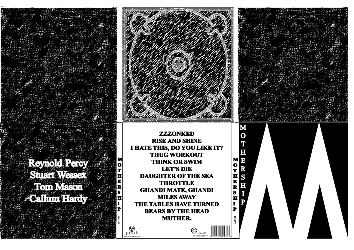
Brackets after song title show original artist.

1. Zzzonked (Enter Shikari)
2. Rise and Shine - original song title
3. I Hate This, Do You Like it? (Chickenhawk)
4. Thug Workout (Don Broco)
5. Think Or Swim (The James Cleaver Quintet)
6. Let's Die (Turbowolf)
7. Daughter Of The Sea (Young Guns)
8. Throttle (Wet Nuns)
9. Gandhi Mate, Gandhi (Enter Shikari)
10. Miles Away (Your Demise)
11. The Tables Have Turned - original song title
12. Bears By The Head (Hawk Eyes)
13. Muther (letlive.)

This track listing was not just a random bunch of songs put together. The lead single, Zzzonked, being the opening track, is a common convention in rock albums. For example Don Broco's 'Priorities', Green Day's 'American Idiot', and Lower Than Atlantis' 'Love Someone Else' are 3 examples of albums that have used the opening track on their album as the lead single and to promote the album, and this is what we are doing here. Track 4, in the case of my itunes library, is often a single, and a fan favourite, for example Deaf Havana's 'Little White Lie's' Green Days 'Boulevard of Broken Dreams' 'Longview' and 'Let Yourself Go' Enter Shikari's 'Juggernauts, Hawk Eyes' 'Headstrung and Kasabian's 'Fast Fuse' all being track 4, and therefore we chose a song which had been released as a single for track 4, being one of Don Broco's most well known songs, as well as a fan favourite. The last track on the album is often the longest, slowest, and song with the most emotion, for example Enter Shikari's 'Constellations' and letlive.'s 'Day 54' The song Muther which we have chose as the last track is the slowest most emotional song from letlive's (the original artists) album, as well as being the longest on the tracklisting here. Often the penultimate song on the album in rock will be a fast or epic song, sometimes the heaviest song on the album, in the case of Enter Shikari's 'Hello Tyrannosaurus, Meet Tyrannicide' and Young Guns' 'Headlights' to end the heaviness and fast part of them album, allowing for the epic, slow, emotional finale, because if there were too many slow songs in a row, people may get bored, especially in the rock genre, the song Bears By The Head, is what I would consider the fastest and heaviest on this album, which is why it has been placed second last. The song directly in the middle, 'Daughter Of The Sea' is the song we all consider to be the best on the album, and therefore it is placed directly in the middle. This, being placed directly in the middle will keep the listener wanting to listen to the second half of the album as well, if they also agree that it is the best, or a very good song.

Wednesday 3 October 2012

The Golden Spiral Rule

The golden spiral rule needs to be considered when we make our Digipak posters, as this rule is used in images and advertisements to make them more ffective and eye cathing, as there is a point that draws the attention of a reader, then the spiral takes their eyes across the whole page so it maximizes the amount of informtaion they take in. This is what makes it an effective technique.


This is the golden traingle rule, we could also use this for our digipak posters as it puts the image into proportion (with the focu of the image in the top traingle and then the two sides split into 2 traigles.)